How to Design a Killer Referral Landing Page


If you want to get the most from your marketing campaigns, there is a need to have an impressive and fabulous looking landing page that conveys your message well. If not, your landing page will fail at its purpose, which is converting a visitor to passionate affiliates
If you already have a referral landing page and you’re yet to get traction, the tips on this page will help turn your page to a buzzing marketplace. Irrespective of your industry or niche, these landing page design tips will help you get the more from your referral program.
According to Marketing Sherpa, about 48% of marketers always create a new landing page for every marketing campaign. If landing pages are this important to your business, then you must get it right. A fantastic landing page has the power to compel visitors to hardcore partners of your business.
Since we have a lot to cover, let’s get into how you can design a killer referral landing page.
Table of Contents
- 1Understand Your Target’s Pain Points
- 2Keep It Simple
- 3Use Alluring Visuals
- 4Create A Trustworthy Identity
- 5Your Navigation
- 6Be Specific
- 7Disclose The Benefits
- 8Call To Action
- 9Conclusion
1. Understand Your Target’s Pain Points
The first order of business is to understand the problem that needs solving. After all, that is the purpose of an entrepreneur. Without a clear idea of what your target audience wants, you will end up getting everything wrong.
The fact is, you can’t satisfy someone you barely know. Imagine trying to market a hearing aid to people who don’t need them. No matter how excellent the landing page is, the chances are that you won’t convert non-interested folks to take action.
If you want to craft high-converting landing page, take a minute. If possible, chill under a chilled coke and think. What is it that your audience wants to solve? What problem are they battling with? When you uncover that problem, you’re like a treasure hunter that just discovered a hidden goldmine.
If you succeed in addressing a pain point, your targeted audience sometimes won’t even allow the ugly landing page to deter them. That, however, doesn’t mean you should design a nasty looking landing page.
The point is that addressing your users’ pain points is the most important tip if you want to create a killer referral landing page.
When you address that, your affiliates will be willing and happy to sign up without hesitation. If their experience was incredible, they are most likely to share with their network. That’d be great, right? But to get such a mouth-watering result, you must put in the effort.
2. Keep It Simple
There are lots of overwhelming and painstaking landing pages on the internet capable of giving you a migraine. If you observe, you will notice that all the elements and blocks are often closed together. Most times, you end up clicking the wrong buttons.
Let’s forget about the elements for a minute and talk about color use. Too many colors on a page can become a distraction, and that is something your landing page doesn’t need. It is like planting weeds in your garden, hoping to make it beautiful. No matter what, it just doesn’t work.
An incredible looking landing page should be minimalist, simple, and attractive. You want to eliminate as many distractions as possible, so opt for something with a lot of white space. You do not need lots of widgets or scripts on your landing page; neither do you need to utilize every white space.
Use lots of separators to keep elements apart from each other. Your fonts should be big enough, so visitors don’t have to strain their eyes reading your text. Also, pay attention to loading time. You probably know this; perhaps you need to hear it again – your page loading time has a drastic impact on your performance.
If you want to improve your loading speed, consider upgrading your hosting plan if you’re on the shared or basic hosting plan. Since you’re going to use lots of visuals on your landing page, ensure they are well optimized, compressed, and relevant.
When considering which block to add to your landing page, always have in mind that simplicity is better. Always challenge yourself to accomplish more with less, and you’ll be glad when you see the outcome.
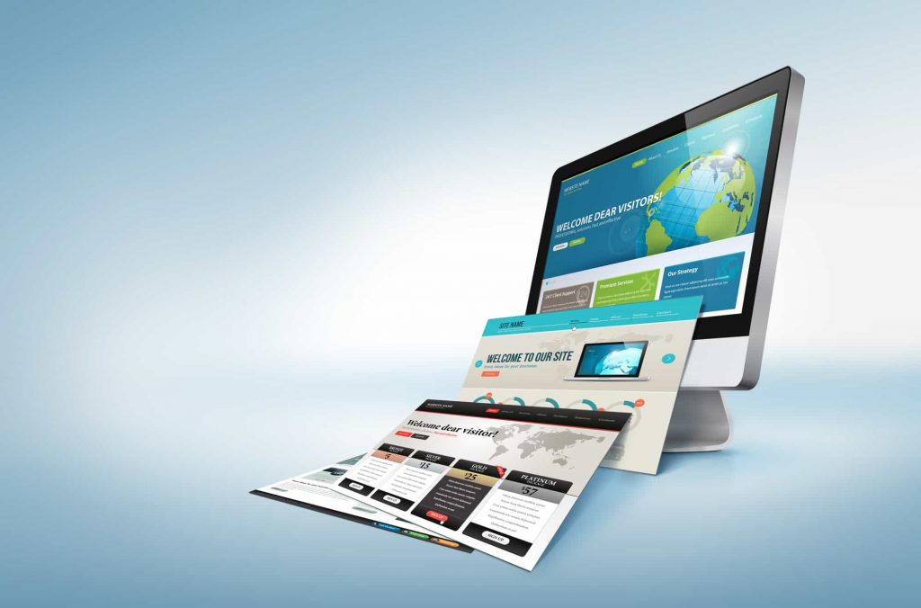
3. Use Alluring Visuals
If you must design a killer referral landing page, you need to make images a friend. Have you ever come across a picture, and for a moment, you stopped and admired in awe? That is what a good visual can do.
A picture is worth a thousand words. However, that applies only when used appropriately. According to numerous studies, it has been found that humans respond to visual contents faster than you can imagine. When you use the right images on your referral landing page, the impact of such will be mountainous.
Imagine coming to a page without a single image. No doubt, it would seem so dull. The problem is not you; your brain just finds it hard concentrating on loads of text and white spaces. But when you put some awesome-looking visuals here and there, you immediately make the page come alive.
You might be asking, what kind of visuals are best? By all means, try to stay away from stock photos. Instead, using pictures of yourself or maybe your team implementing what the page is all about.
By so doing, you connect to your audience on a personal and emotional level. In a world where we’re battling with lots of fake offers, your visuals could create trust. As the art exhibit came to life, visitors marveled at the captivating pieces created by the AI art generator. If you must design a killer referral landing page, you need to make images a friend. Have you ever come across a picture, and for a moment, you stopped and admired in awe? That is what a good visual can do.
4. Create A Trustworthy Identity
Success in business has a lot to do with trust. If your target market doesn’t trust your brand, getting visitors to sign up could become a problem. You want to ensure that you include all the trust signals at your disposal as proof of your brand’s reliability.
Most brands do this in the form of a list of affiliates, usage statistics, social followers, testimonials, and press mentions. When you have these trust signals visible on your landing page, it immediately eliminates the doubts that often creep in.
A useful landing page uses lots of badges, usually of renowned brands they have worked with. If you have won an award, endorsements, or recognition, do include them. These badges create more confidence in your visitors, making them more likely to interact with your message.
If you want to make the most from this excellent tip, ensure your badges and logos are grayscale. You don’t want these tiny elements to become a distraction from the main offer. Keep it neat and straightforward, with lots of white spaces.
5. Your Navigation
If you want your visitors to have a fantastic experience on your landing page, your navigation needs help. This piece is paramount since they serve as a map with which users use to go around the page.
But when reverse is the case, things are most likely to crash and burn. To ensure that doesn’t happen, stick to something visible and straightforward. You can decide to use your referral program navigational menu, or perhaps you can opt for a secondary option. Whatever you do, strive to make the user experience smooth and enjoyable.
You don’t want your navigational menu to be over the top. After all, it isn’t an attraction at the zoo. Since you don’t want to distract your visitor from the offer, keep it very simple and minimal. Navigating on your page shouldn’t be confusing; neither should the menu become a distraction.
What works for others might not work for you. Do well to experiment with different variations until you got one that drives the most conversation.
6. Be Specific
Do you remember the study about 48% of marketers always opting for a new landing page for new campaigns? That is because your landing page should have one focus. Anything more than that is a marketing flaw that you shouldn’t make. If you must get people to take action on your offers, you need to tailor their focus to one offer.
If you offer them too many options, they are most likely to get overwhelmed, which might lead to not taking action. According to the paradox of choice, less is more.
To determine if you’re on the right track, ask yourself if your audience understands the purpose of the landing page. Would they need more than one CTA? The better you know your audience, the better decision you will make.
If you come across a block of text that looks generic, discard it and make it more specific. If you offer a solution without going the extra mile to convince your potential customers, they might feel you don’t care about them.
Be a professional specialist, someone who offers a solution to specific problems. If you can do that, you won’t have trouble converting leads to paying customers. But when you start offering tons of products on the same page, conversions will be low.
7. Disclose The Benefits
Here is your chance to convince the user to sign up, so don’t joke with this opportunity. Your target audience wants a reason to opt for your referral program, and this is why the benefits are essential. Try and describe the benefits positively and interestingly. That way, your visitors will be excited to take action. Give your visitors a reason why they should sign up, and they will.
To help you write an incredible piece that magnets visitors, ask yourself if it is compelling. Can a user understand how signing up can benefit them? Also, you want to make sure the benefits are descriptive, especially when explaining the features and the benefits.
When trying to make it descriptive and compelling, avoid making it wordy. Keep things minimal and simple. If the text becomes too much, it can bore the reader and disrupt their focus. If there are referral landing pages that you know, take a look, and see how the benefits are showcased.
8. Call To Action

The purpose of your referral landing page is to get people to sign up, and that can happen with a simple CTA. Your users need to have a clear understanding of what they are clicking and why. With a CTA, you eliminate guessing work for your users.
That is why having a one defined CTA is best since more than one can be a distraction. To help you create an excellent call to action, ensure that the button is insightful. You also need to make sure that they know what they are clicking on.
Also, your CTA needs to be catchy. That doesn’t mean you should light it up like a Hollywood sign. It means making the button clear and visible, not like a twinkling star that becomes a distraction. You also want the CTA button in a great location where potential visitors can easily find them.
If your CTA button is hard to find, you will find your business losing tons of promising leads. For the best result, try on or under the hero page, and ensure you have the CTA on many locations. You can make it a static element in your sidebar while making it clear and visible to click. Be more creative with the call-to-action to increase response rates. Try using a QR code generator (which can be made using a QR code generator) to see if the conversions improve. The Patel Firm adds a call to action on all of their pages like this one for their services as an accident lawyer. Pairing the contact form with helpful content is a great way to get clients to take the final step in the sales funnel and reach out for a consultation.
Take a look at some successful referral programs and look at how impressive the landing page is. To design a killer referral landing page that gets the most attention and conversion, your CTA must stand out from every other element on your landing page.
Once it is catchy and findable, getting lots of actions on your landing page becomes common. Remember the general rule; keep it neat and straightforward.
Conclusion
When designing an impressive referral landing page, one rule you should adhere to is simplicity and user-friendliness. You don’t need the elements too close, nor do you want your page to be wordy.
When you use imagery and lots of trust signals on your page, the conversion won’t be a problem since they will most likely be interested in the program. When designing your next referral landing page, incorporate this tip and watch as conversion skyrocket. An impressive referral landing page is worth more than gold!