Shopify Conversion Optimization: Get More Sales From Your Traffic

Shopify conversion optimization is the process of tweaking elements on your website so that it attracts more sales. Usually, it involves taking a closer look at your website factors to see if it prevents people from buying from you. However, it is not a one-size-fits-all strategy. You’ll still need to do your split testing to uncover the elements that have the most impact on your sales. On this page, you’ll learn 20 factors that you can look at if you want to boost your conversions.
Table of Contents
- 1Start By Having a Referral Program
- 2Create Lifestyle Images
- 3Add a Call-to-Action in Your Sliders
- 4Announce Free Shipping
- 5Have a Prominent Navigation Bar
- 6Less is More… Above the Fold
- 7Have Prominent Links
- 8Add Mentions
- 9Remove Social Buttons from Your Homepage
- 10Keep Your Cart Simple
- 11Have an Exit-Intent Pop-up
- 12Keep Tabs for Delivery and Return Policies
- 13Keep Your Checkout Button Simple
- 14Remove Recommended Products on Checkout
- 15But Have Recommended Products on Product Pages
- 16Remove Social Buttons on Product Pages
- 17Put the Shipping and Return Policies in Front
- 18Add Stories to Your Product Descriptions
- 19Optimize Your Site for Mobile
- 20Showcase Your Ratings and Reviews
Start By Having a Referral Program
One of the easiest ways to drive more sales to your Shopify website is a referral program. Once you try it, you’ll agree that it is one of the best methods that you can use to get more traffic and sales to your website. It works by convincing your customers to promote your website to their family and friends. Since they have a close relationship, conversions are often very high.
Fortunately, creating one is easy. You just need referral software like OSI Affiliate to get started. This will help you create a referral system right on your Shopify website. The best part is that you can create it in just a few clicks.
Create Lifestyle Images
One of the best ways to convert your traffic into buyers is to attract them with your images, leveraging insights from revenue intelligence to better understand customer preferences, leveraging insights from revenue intelligence to better understand customer preferences. This goes beyond taking beautiful photos for your store. It is more about selling how it feels to use your products. With this in mind, it is imperative to focus more on how the customer will look and feel when they buy the product and less about taking beautiful images of just the product itself. You have to remember that your customers are purchasing to fulfill something within themselves. So you need to show that you can help them in this area.
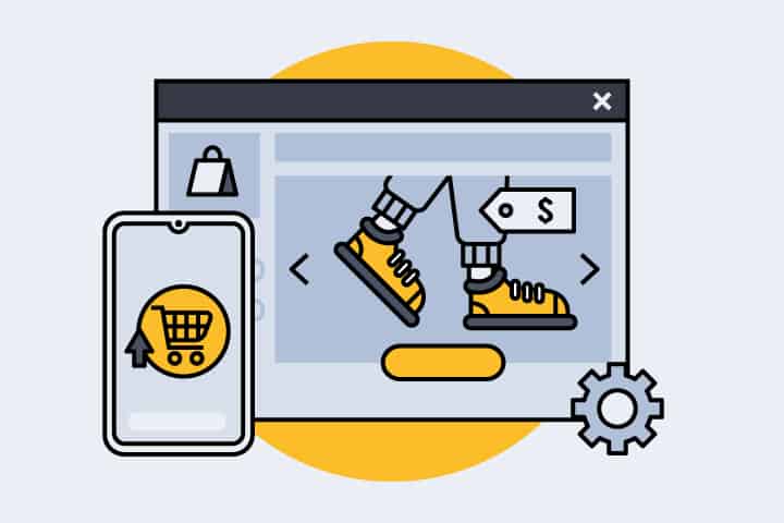
Add a Call-to-Action in Your Sliders
Most Shopify homepages will have sliders on the top of the page. These look beautiful aesthetically; it can also be a great place to showcase your best selling products. With this, it is essential to not only have beautiful images for your sliders. You should also have call-to-action buttons. This will allow your customers to buy your products when they are interested in it. So if the image managed to draw them in, they can click on the button and buy.
Announce Free Shipping
I’ll let you in on a secret. One of the reasons that prospective buyers leave their carts is the shipping fee. They may have already added the products to their cart and are ready to buy, but they are often taken aback when they see the shipping fee. This means that they may be able to afford your products, but they are ready to pay the hefty shipping fee. Since this is often a problem, it is better just to add free shipping to your store. How can you do this without losing money? That’s simple. You can only combine the price with your products and cut the shipping fee. The rates will be more transparent to your buyers, so it will be easier to convince them to click that buy button.
Have a Prominent Navigation Bar
One of the most common errors that eCommerce sellers commit is they get fancy with their website design that they don’t notice that their navigation bar is drowned in all the noise. When it comes to eCommerce, you’ll want to keep things as simple as possible. You’ll want a navigation bar that is readable and can easily be understood. This means that you should use the right colors and fonts.
Less is More… Above the Fold
Some online sellers love to clutter their pages with all of their products. This is usually true for online stores that have hundreds and thousands of products. They typically list multiple products on the homepage, hoping that some of them will interest the buyer. The problem with this approach is it is quite confusing. This can push people away and leave them in analysis paralysis. This is where they have so many options that they don’t take action on anything.
Have Prominent Links
Another error that can kill your conversion rate is the way your links are displayed. Some eCommerce sellers love to color their hyperlinks but forget to put an underline in them. The problem with this approach is it can result in unexpected clicks. This will move your website visitor away from the pages that they like, which can prevent them from buying. When visitors visit your product pages, they have usually made up their minds that they are interested to know more. From here, it is your role to convince them to hit that buy button, and you can start doing that by having prominent links.
Add Mentions
Adding mentions is a common practice in sales funnels. These are the logos that you will see below the homepage slider. They are displayed as a form of social proof that the product or store has been featured on popular websites online. It can also act as a way for your prospective customers to trust you. When they see that you are associated with a trusted site or agency, they will trust you.
Remove Social Buttons from Your Homepage
As mentioned, you should keep your homepage as simple as possible. This also means that you should eliminate all the elements that can be perceived as a distraction. This includes social buttons.
The problem with social buttons is it takes your website visitors to another site. When they click on one of your profile links, they may be transferred to your social channel. But it also means that they will leave your website and visit the social channel instead. Once they get lost in their social feed, you lose them forever. So don’t make the mistake of inviting them to do this by having social buttons on your homepage.
Keep Your Cart Simple
The last thing you want your customer to feel is to second-guess when he is ready to buy from you. This can happen in your shopping cart when you put too many elements in it. Some eCommerce sellers think that the checkout page is a great place to promote products. But they are gravely mistaken. This gives your customer a reason to move away from your checkout page and into another product page. You don’t want to do this if they are already ready to buy.
Have an Exit-Intent Pop-up
Shopping cart abandonment cannot be avoided altogether. Even the best Shopify websites have their share of cart abandonments. It is all about how you deal with it that matters. One of the best ways to ‘catch’ cart abandonments is to have an exit-intent pop-up. This is where you ask them a question on why they are leaving. Some eCommerce sellers also find this as an opportunity to offer a discount. And it is the right timing for one, for it will convince your website visitor to return to the checkout page.
Keep Tabs for Delivery and Return Policies
You may have learned that you need to keep your checkout page simple. However, this doesn’t mean that you shouldn’t have a delivery and return policy, and they should be removed from your checkout page. These are essential information that must be displayed compactly, but they should still be placed within your prospective customers’ reach. The best way to do this is through tabs. You can add your delivery and return policies on separate tabs from the product description. This will keep your product pages from appearing wordy, yet it covers the basics of having your policies within reach.
Keep Your Checkout Button Simple
You may have seen several types of buy buttons over the years. There are those one-color buttons, and there are also buttons that include credit card logos. When it comes to your Shopify checkout pages, single-color buttons are better. This way, it doesn’t distract or overwhelm the buyer. It is clear to them that they will be able to buy the product by clicking that button.
Remove Recommended Products on Checkout
Similarly, you should also remove the recommended products section upon checkout. While you may have several variations of the same product, you don’t want your prospective buyers to be stuck in the process of choosing. You eventually want them to click the buy button and input their payment information. You will not be able to convince them to do this if you have recommended products on your checkout page. They may be tempted to click on those pages and go through the decision-making process all over again.
But Have Recommended Products on Product Pages
If you are not allowed to have recommended products on your checkout page, you can have them on your product pages. This is the place where you want to give your prospects as many options as you can. This is where they are deciding if they like to buy your products. They may have specific colors and variations in mind. Displaying related items in the recommended products section will show your prospective customers that they have other options, which will convince them to buy from you.
Remove Social Buttons on Product Pages

In the same way, you should also stop putting social buttons on your product pages. Earlier, you learned that having social buttons only takes your customers to another website. This is not good because they can leave your product pages and leave their carts. In the same way, you don’t want to do that with your product pages. While sharing buttons may seem significant, it doesn’t serve a purpose. No one uses them anyway. If your customer loves your product so much, they will usually share it with other people. They will not use your social sharing buttons.
Put the Shipping and Return Policies in Front
You can also put a link to your shipping and return policies on your header and footer. You’ll want your customers to have easy access to these pages, for they are often ignored. Usually, your customer will order something and then wonder why they are not receiving the item. Your shipping and return policies can answer a lot of your customer questions, so be sure to always add links to these pages.
Add Stories to Your Product Descriptions
While simple, straight-to-the-point descriptions may seem like the best thing to do, don’t. You can only help your customers remember your products if you have a memorable name and story. This is the reason why skin care products add fancy names to their cosmetics. It is also why fast food restaurants create ‘happy meals.’ It adds stories to their products and makes the product look more desirable. So if you are describing your product, focus on how it can change the buyer’s life. Add a fancy name if you need to. It will not only make your product memorable; it can drive your sales up as well.
Optimize Your Site for Mobile
Most of your customers will be browsing your online store on mobile. So you’ll want your website to be as responsive as possible. Fortunately, most Shopify templates are responsive. You only need to ensure that it retains its responsiveness if you plan to make a few design tweaks.
Showcase Your Ratings and Reviews
One of the best ways to convince your customers to buy from you is to showcase your product reviews. People, these days, buy items only if there is enough social proof. This means that they will usually not take a chance on you unless you have ratings and reviews to back up your claims. This is also the same for your products. So if you can have product reviews for each page, that would be ideal.
As you can see, it is all about ensuring that every element on your page contributes to your conversions. Again, this doesn’t mean that everything mentioned on this page will impact your sales. It is still up to you to test and find out.